menu
A Bold Rebrand with a Fresh Vision: Branding & Website Design for Paradise Copy Co.
January 13, 2025
From Emily Dilworth Creative to Paradise Copy Co
When Emily Dilworth Creative approached us, it was clear they were ready for a transformation. With a mission to elevate their copywriting business for wedding professionals, they envisioned a bold, luxury brand that would stand out in the market. The result? Paradise Copy Co. – a brand that’s as vibrant and distinctive as the Bird of Paradise flower that inspired it.
Here’s a behind-the-scenes look at how we rebranded, redesigned her website & brought this all to life!!
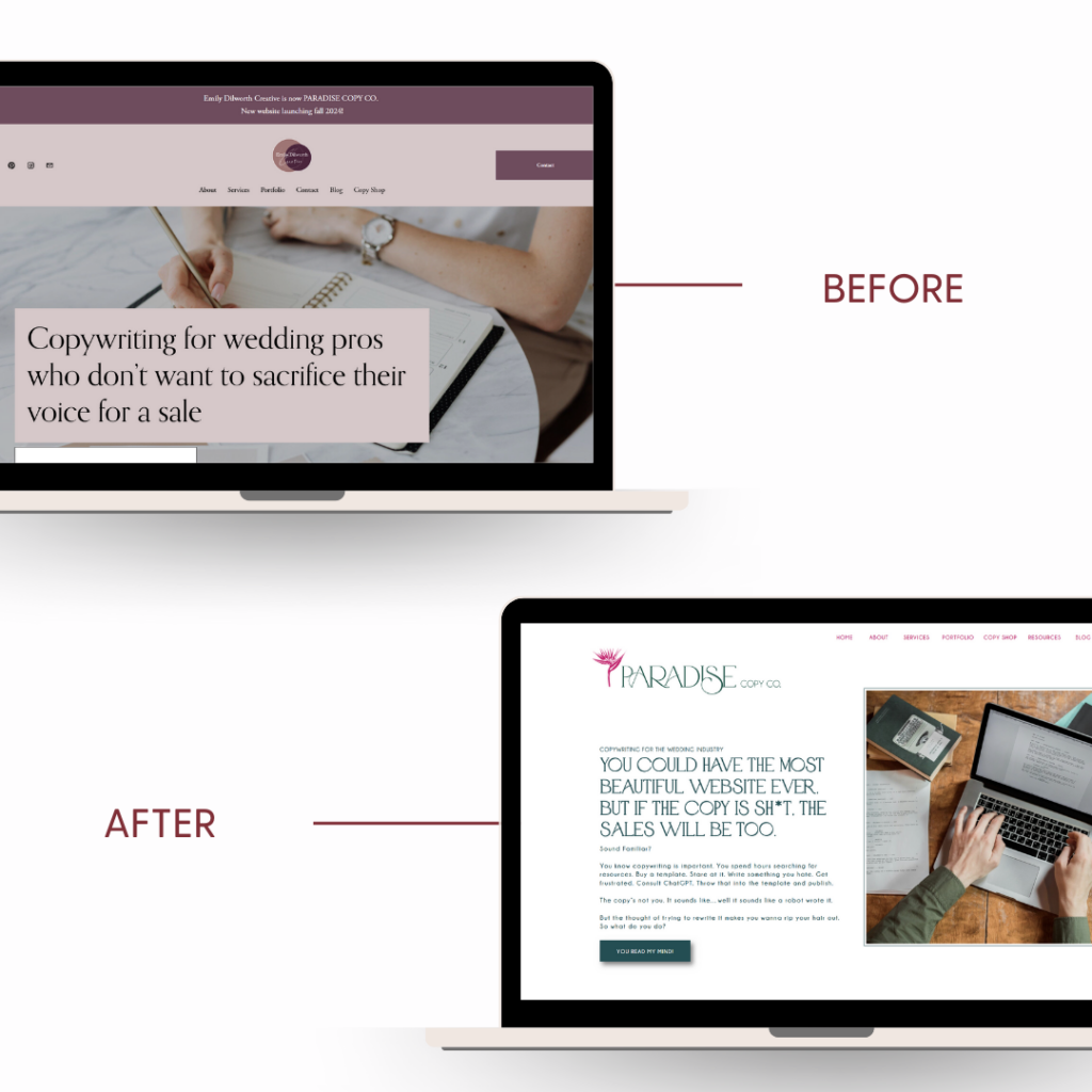
The Before
Emily Dilworth Creative had an established reputation for delivering exceptional copywriting services (and as a client myself, I can say for certain she knocks it out of the park!!!!). However, the visual and digital presence of the brand didn’t reflect the upscale, unique approach Emily wanted to convey. The logo, colors, and overall aesthetic leaned towards neutral and safe, which didn’t fully capture the bold personality and creative flair that set the business apart.
Key challenges:
- A logo that lacked distinction and didn’t align with the brand’s desired luxury vibe.
- Colors and fonts that felt generic rather than unique and memorable.
- A website that functioned but didn’t exude the high-end appeal or cohesive storytelling needed for the brand’s target audience.

The Vision
Emily’s vision for Paradise Copy Co. was clear: a brand that exudes bold vintage vibes, luxury aesthetics, and a distinctive edge—much like the Bird of Paradise flower. It needed to appeal to wedding professionals looking for elevated, personality-driven copywriting services that stand out in their competitive industry.
The Transformation
We approached the project with a full-scale rebrand, including:
1. Logo Design
The new logo captures the luxury and retro-inspired aesthetic that Paradise Copy Co. represents. With clean lines, a sophisticated serif font, and subtle tropical elements, the logo now feels both timeless and unique.


2. Color Palette
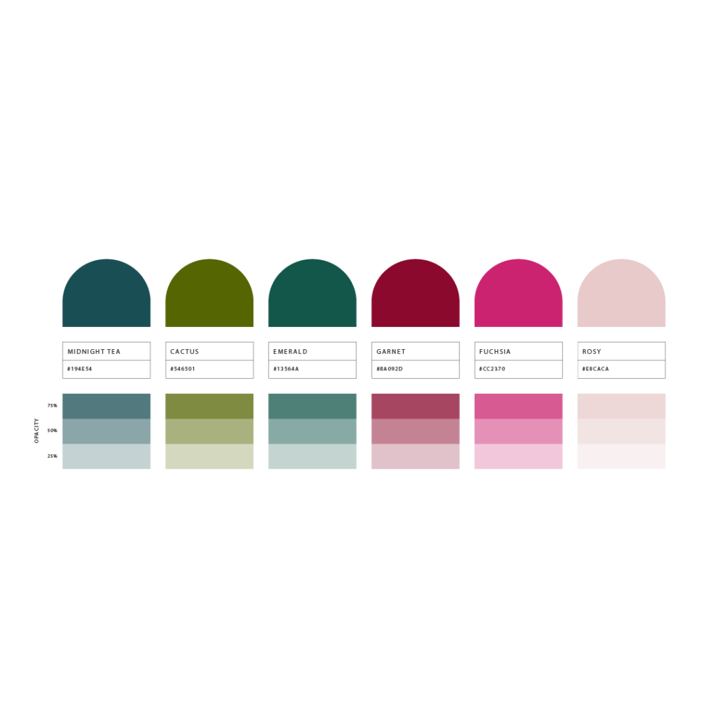
We developed a rich color palette of jewel tones—teals, greens, and purples—balanced by softer oranges and beiges. This mix creates depth, contrast, and a sense of luxury, perfectly reflecting the brand’s personality.
3. Typography
Inspired by retro beach club vibes (think HBO’s The White Lotus), we selected bold vintage-inspired fonts that stand out while remaining elegant and approachable.
4. Imagery and Mood Board
We curated imagery that evokes the paradise theme—lush landscapes, warm sunsets, and striking florals—creating a consistent, aspirational look across all brand materials.

5. Website Design
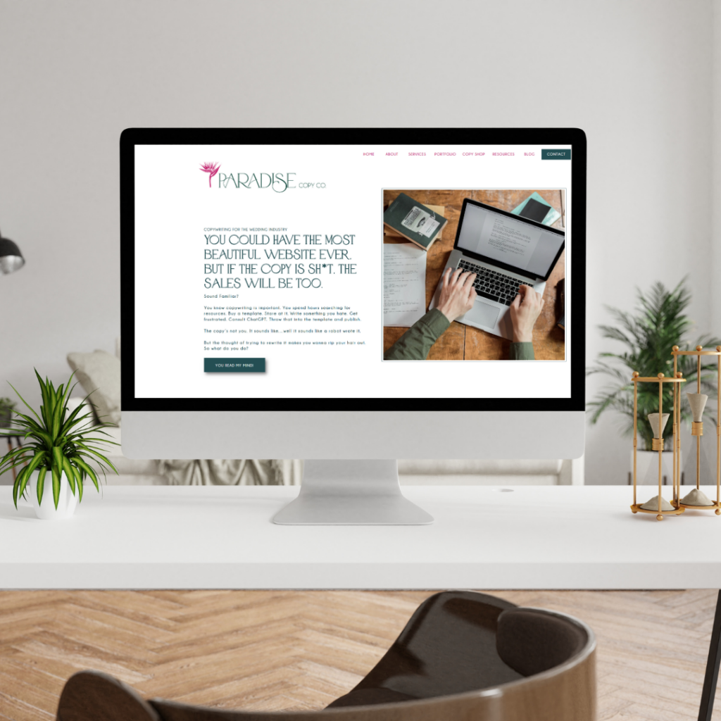
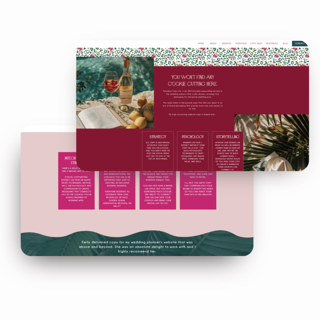
The new website is the crown jewel of the rebrand. Designed on a platform that’s both visually stunning and user-friendly, it showcases Paradise Copy Co.’s offerings with:
- High-impact visuals that immediately capture attention.
- Thoughtfully written copy that speaks directly to the target audience.
- Seamless navigation and clear calls to action that guide visitors to inquire about services.
The After
The rebrand has transformed Paradise Copy Co.’s digital and visual presence into one that feels authentic, bold, and undeniably luxurious. The feedback from Emily and her audience has been overwhelmingly positive, with an immediate uptick in engagement and inquiries from dream clients.
Key results:
- Increased Engagement: The new website’s bold design and clear messaging have captivated visitors, leading to longer time spent on the site.
- Stronger Brand Recognition: The distinctive visuals and cohesive branding make Paradise Copy Co. unforgettable.
- Outstanding Feedback: Emily has already reported rave reviews from wedding professionals aligned with her target market.
Check out Emily’s new website here!!
Want to See More Transformations?
Helping businesses like Emily’s evolve into standout brands is what we do best. If you’re ready for a rebrand or website upgrade that aligns with your vision and goals, let’s chat!
👉 Contact us today to start your transformation.
P.S. Love a good “before and after”? Click here to explore another client transformation and see how we bring brands to life!
Leave a Reply Cancel reply
Want to fill your IG feed with
pretty branding things?
You’ll find lots of logos and website designs from fantastic brands I’ve worked with, and of course all the color palettes, oh, and lots of biz resources to help you elevate your existing brand and stand out in the crowd.
Let's Connect
Emily is the founder of Faye Street Creative, a boutique branding agency providing branding and web design services. Faye Street specializes in Showit website design and brand development for small businesses.
Based in Richmond, Virginia
and working with badass business owners worldwide.
stay in touch
Privacy Policy
© Faye Street Creative // powered by showit